In developing the Intranet.ai brand, the focus was on building a strong visual identity that not only reflects the company’s mission of delivering a user-friendly platform but also ensures an engaging, modern experience. Our design process started with the creation of a logotype, leaning into a vibrant yet professional aesthetic that aligns with the fast implementation and seamless integration the product promises.

Logotype and Color Palette
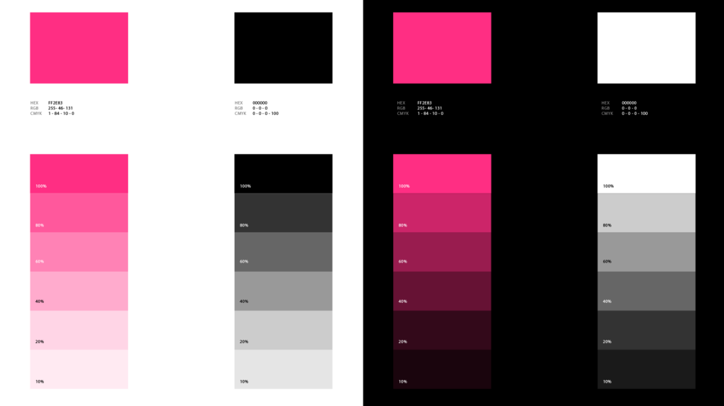
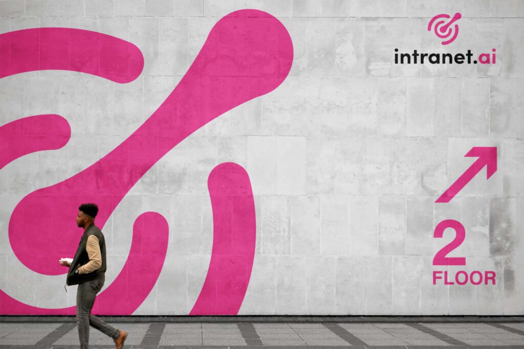
The logo uses a sans-serif typeface known for its clarity and clean lines, representing simplicity and accessibility, essential attributes of Intranet.ai’s product. The color scheme is built around a deep black contrasted with a bold and dark vibrant pink. This color combination is designed to convey a striking, modern presence, with the black symbolizing professionalism and the pink bringing an energetic, forward-thinking accent. The logo subtly hints at interconnectedness and fluidity, evoking imagery of ripples expanding outward—a nod to the way Intranet.ai enhances collaboration and communication within organizations.
Typography and Visual Hierarchy
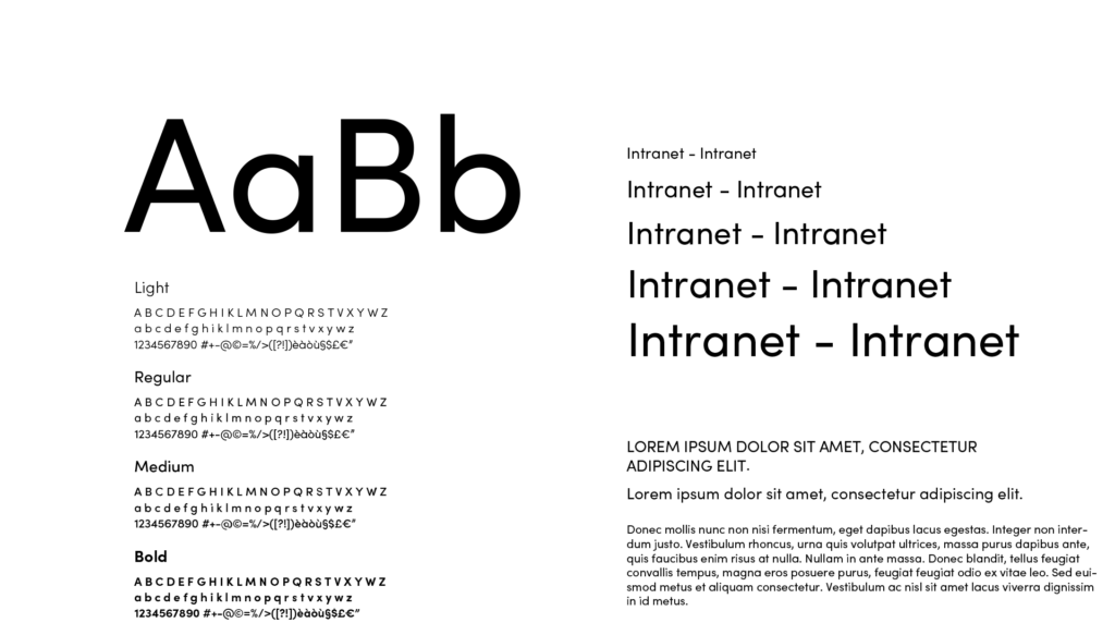
The choice of a sans serif primary typeface was intentional, aimed at delivering a modern yet timeless feel. It maintains high readability across digital platforms, supporting Intranet.ai’s goal of providing a user-friendly experience. The typography system emphasizes clarity in communication, with a hierarchy that ensures important information is always easy to find and digest. In headlines and key marketing messages, the typography carries a confident tone without feeling overly formal, striking a balance between professionalism and approachability.
Brand Imagery and Dramatic Visual Effects
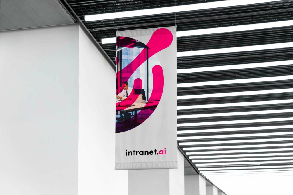
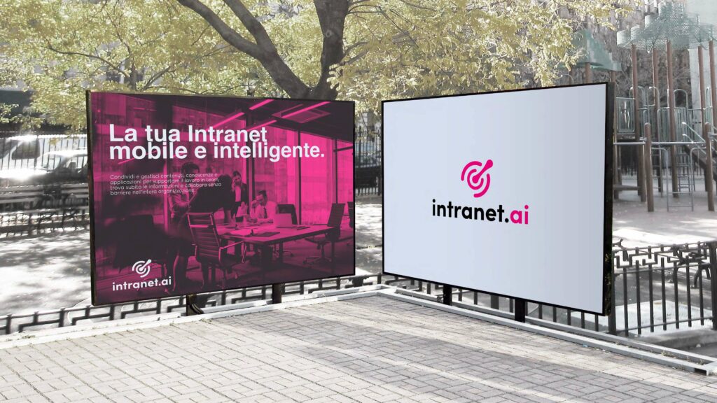
The visual identity is further enhanced by a selective use of imagery. A key part of the design involved using black-and-white photography with pink overlays, which adds a dramatic and contemporary edge to the brand’s communications. This technique allows for dynamic contrasts, enhancing the brand’s bold, modern voice. These elements make for striking visuals in both print and digital formats, allowing Intranet.ai to stand out while maintaining a consistent and cohesive identity.
Digital Touchpoints and Website Direction
Our branding efforts laid the foundation for the visual and user experience design that characterizes the Intranet.ai website. We established the guidelines for color usage, typography, and tone that shaped how the website would reflect the brand’s energetic yet professional ethos. The brand’s visual style was intended to extend seamlessly across the website, hinting at vibrant pink accents paired with deep blacks to create a striking digital presence.

Additionally, some of the imagery guidelines, like pink-tinted overlays on monochrome photos, were intended to translate into web graphics, ensuring a consistent experience across all customer touchpoints. We paved the way for an immersive website experience, leaving room for elements like comic-style illustrations and fine hairline strokes—popular design trends today—to be incorporated, giving the brand a modern appeal without losing its professional tone.
Brand Consistency and Future-Proofing
The brand identity for Intranet.ai was also created with scalability in mind. As the company evolves and expands its product offerings, the branding is flexible enough to accommodate new features and developments. The balance between the bold color palette and clean typography ensures that new content can be added without overwhelming the brand’s core identity. This approach ensures that Intranet.ai can continue to deliver on its promise of being user-friendly, adaptable, and fully integrated with Microsoft 365 applications.
Conclusion
Our comprehensive work on the Intranet.ai brand extends beyond aesthetics. We believe we built a strong, future-proof identity that communicates the essence of a product designed to be efficient, engaging, and customizable. This identity lays the groundwork for all future brand touchpoints, ensuring that Intranet.ai’s message of productivity, integration, and rapid deployment resonates clearly with every interaction.